Overview

Buying a car can be a time-consuming and frustrating process. Customers often visit multiple showrooms, manually compare options, and navigate lengthy document submissions. As the sole Product Designer on this project, I was tasked with bringing an innovative car-buying platform to life.

My role as Lead UX Designer involved conducting over 20 hours of user interviews, creating wireframes and prototypes, collaborating with developers, expanding the design system, and testing the new design with users.

⚠ Due to NDA restrictions, certain details and visuals have been modified or omitted.
Problem Statements

Buying a car presents a few challenges:


  • 1

    Long process: Users have to go back and forth to showrooms, taking time to explore different options.

  • 2

    Lengthy document submission: Submitting documents is tedious and time-consuming, leading to frustration.

  • 3

    Lack of transparency: Users often don’t have a clear view of their deal and offer details upfront.

My Role

Sole Product Designer

January 2024 - Present (1.5 years)

As the Product Designer leading this project, I was responsible for the end-to-end design process, from research and ideation to final implementation. I worked closely with product managers, stakeholders, developers, and users to ensure the redesign met both business goals and user needs.

Key Responsibilities

  • User Research

    Conducted UX research with 10 in-depth user interviews. Transcribed and analyzed data using thematic analysis to uncover insights that informed design.

  • UX Design

    Mapped the full user journey and flow with the Product Manager. Created wireframes and interactive prototypes through 7+ iterative design rounds.

  • Visual Design

    Designed the platform from scratch and built new design system components to support missing use cases.

  • Developer Collaboration

    Documented dev notes for every iteration and worked closely with developers to implement and QA designs using Jira (Agile).

  • Cross-Functional Collaboration

    Presented design rationale and end-to-end flows to teams across business, finance, marketing, product, development, and design.

  • Accessibility Advocacy

    Championed usability and accessibility, aligning designs with WCAG standards.

Tools & Methods

Figma
FigJam
Jira
Lark
Miro
Google Suite

Research

I conducted a comprehensive research phase including:

User Interviews

Conducted 10 in-depth interviews with external participants to understand pain points and user behaviour.

Competitive Analysis

Analyzed 5 competitor platforms to identify industry best practices.

Thematic Analysis

Carried out thematic analysis on the interview data to document insights and present to the team and stakeholders.

User Journey Mapping

Created user journey maps and flowcharts to identify key friction points.

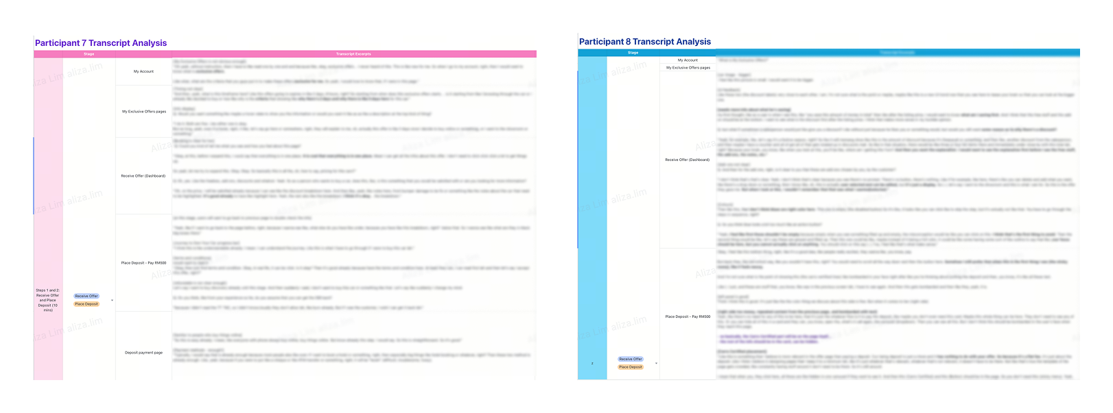
Below is a sample of the data analytics using thematic analysis. (Blurred for confidentiality)

Research findings visualization

Key Insights

  • Users prefer a clean, clear interface with instant clarity, minimizing cognitive load.

  • Transparency and trust are crucial - they frequently question details and want to understand exactly what they’re paying for.

  • Unclear information leads to confusion; users prefer details to be straightforward and easy to grasp at a glance.

  • Buying a car is a major commitment, so they want an easy way to contact support if they are unsure about anything.

  • Users also provided feedback on the design and colour schemes, which led to expanding the design system to enhance UI consistency and accessibility.

Design & Iteration

Defining the User Flow & Gathering Requirements

At the start of the project, I worked closely with the Product Manager to map out a guided user journey - from comparing dream car options to confidently making a purchase decision.

We also had discussions with teams across Product, Engineering, Finance, Business, and Marketing to gather requirements, check protocols, and ensure alignment across departments.

Design System & Custom Components

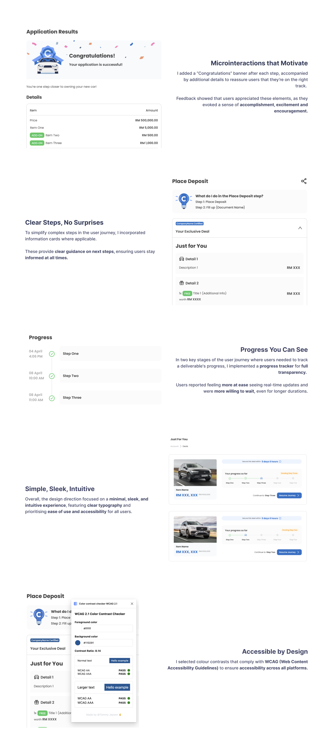
During the design phase, I started with early wireframes to establish the visual style. Since this was a brand-new platform, we had to get creative in how we presented information to customers. I explored the existing design system, identified missing use cases, and created new components to add to the library.

The design phase was a long one - we iterated based on both user research and stakeholder feedback, going through over 7 full end-to-end iterations before landing on the existing version (still a work in progress as of now). Through it all, I made sure to maintain consistency in layout, typography, and interaction patterns, while prioritizing usability, accessibility (WCAG compliance), and visual clarity.

Please find samples of some of the design elements below. (Some elements have been amended for confidentiality purposes.)

Visual design components

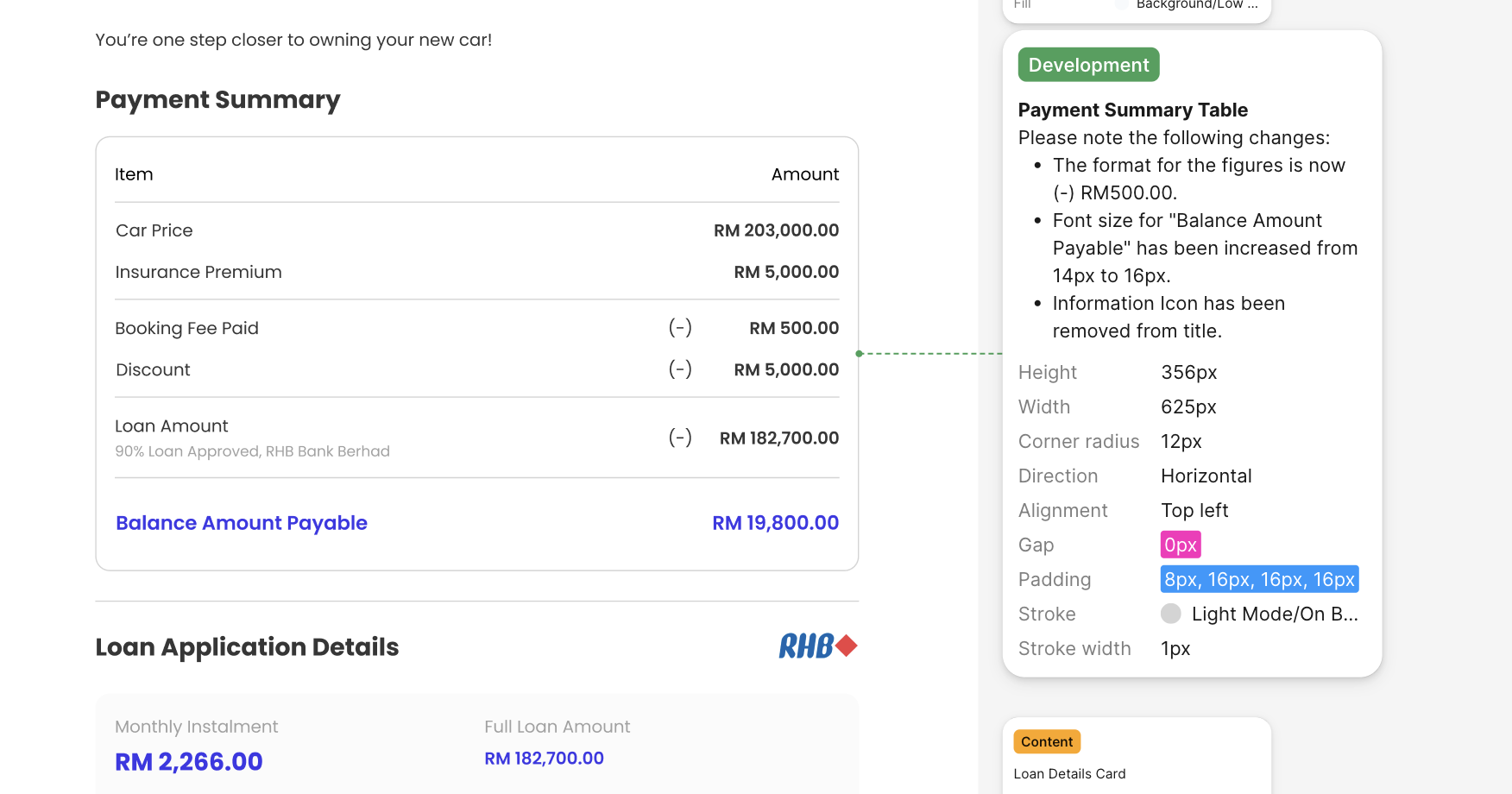
Development handoff & QA

Once the prototypes were finalized and presented to stakeholders, I prepped everything for developer handoff. I included detailed developer notes to ensure clarity on requested changes and hopped on calls after each iteration to walk the developers through updates, clear up any ambiguities, and provide proper documentation. All changes were tracked and documented in Jira for easy reference.

In later stages, I conducted QA on Staging to catch and resolve usability issues, worked closely with developers to fix usability concerns and refine interactions, used Jira (Agile) to track issues, report fixes, and maintain a smooth workflow, and ensured the project stayed on track and aligned with the intended user experience.


Visual design components

Prototyping & Testing

I created interactive prototypes to support user research and usability testing. Based on the feedback received, I iterated on the designs to address key usability issues. The video below is a short demo showcasing a snippet of the platform. If you’d like to see a more detailed walkthrough, please don’t hesitate to reach out.

Video Demo (Snippet)

Results & Impact

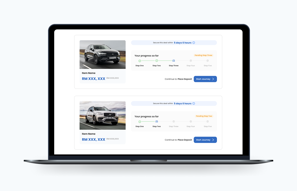
The redesigned platform features a clean, intuitive interface with improved navigation, clear visual hierarchy, and a modern aesthetic that aligns with the brand's values.

During the user interviews, the feedback we got was...


9/10

Satisfaction Score

8.8/10

New satisfaction score

-45%

In user workload

User Feedback

"It's very clear. I like the transparency, makes the process very easy." [Participant 2]
"The design is very clean. Very modern. And the illustrations are so cute." [Participant 4]
"Will definitely reduce our workload significantly. It's a better experience and will help with higher closing rate." [Participant 8]

Users were genuinely excited about this new, simplified way to explore and buy their dream cars. The streamlined journey felt intuitive, efficient, and easy to follow—letting them move at their own pace without feeling overwhelmed. Some standout highlights they appreciated:

1

A clean, intuitive interface

Users found the interface easy to navigate, even without prior experience buying new cars online. By involving them early, we uncovered confusion points in layout and flow that we were able to smooth out through iteration.

2

Clarity and transparency at every step

Testers appreciated knowing exactly what to expect throughout the journey. Clear copy, upfront info, and structured layouts helped reduce decision fatigue.

3

Engaging visuals and thoughtful details

Even though this was a brand-new offering, the sleek visuals, info cards, and accessibility touches (like readable fonts and logical flows) made the experience feel polished and trustworthy.

Key Takeaways

Some takeaways were:

Deep User Research

Early user involvement helped uncover confusion points, which we refined through iteration to create a smoother experience.

Clarity Through Collaboration

Cross-functional teamwork and clear communication reduced friction and improved decision-making throughout the journey.

Accessibility First

Inclusive design choices, like readable fonts and structured flows, made the platform feel polished and welcoming for everyone.

Summary

Closing Remarks

This project has spanned 1.5 years so far and is still ongoing, making it the longest I’ve worked on as a designer thus far. Despite its duration, it’s been incredibly rewarding.

I had the opportunity to lead the project independently, taking full ownership from start to finish and successfully delivering everything on time. Being entrusted with such a significant responsibility so early on in this company has been such a great experience and I can't wait to see how this platform will help its users.

Thanks for reading! If you'd like to know more, feel free to reach out!